The AR Virtual Fitting Room
The AR virtual fitting Room is a future application in daily life. I defined the information architecture, and user flow to create the 3D user interface (UI). This project went through twice validation of the user testing. I realize the difference in design thinking of 2D and 3D user interface. In the end, we used the dynamic changing UI which could be micro adjusted based on the user’s body proportion.

The Everlight Chemical Industrial Corporation wanted to demonstrate the future application of their products in the headquarters’ showroom. One of their products is a color chemical that could be applied on textile, leather, metal, and paper materials. The final product is in our daily life such as clothes, leather bags, and shoes. This project wants to build an interactive system to show the future application of Everlight Chemical of color chemicals.
Scenario
People are used to doing online shopping for clothes, shoes, and accessories today. The scenario is set up where people could have advanced experiences for trying on the virtual clothes before the goods are delivered to customers in the near future. (see image 01)They can wear the virtual outfit and send it to friends and social media to ask for advice. Visitors could understand what kinds of products use Everlight’s color chemicals products on it. Therefore we created the AR virtual fitting system near the bedroom area in the Everlights’ showroom.

Image 01: 3D rendering AR virtual fitting system in the bed room.
User Interface Design V1.0
Information Architecture (IA) version 1.0

Image 02: the diagram shows the three level on the hierarchy
There are three main elements of the AR Virtual fitting system which are textiles, camera, and browsing. The textiles element includes the 10 clothing tops 3D models and 10 bottoms 3D models. The camera element includes taking photos and sharing them online. Browsing is the action element for clothes selection including the left, right slide browsing, and confirmation. (see image o2: the IA diagram)
The user flowchart is based on the information architecture diagram. (see image 03) The screen would be a screensaver model when no one uses it for a while or passes by the motion sensor. Autostart means the user interface will pop up the selection elements when the people get into the sensing area. The users can select the tops and bottoms and preview what they will look like. The user could take a photo when they confirm which tops and bottoms they like. The system will show the QR code after the users take a photo. If the user doesn’t like their selection they could choose to retake. If the user doesn’t give any other input in the five seconds the system would go back to the screen saver model.
User Flowchart version 1.0
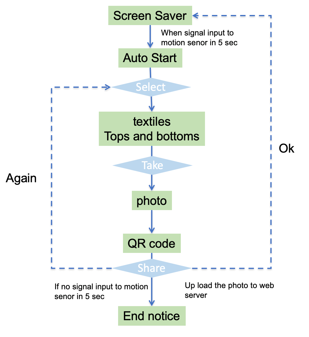
Image 03: 6 steps and 3 actions of the user flower
User Interface Mockup v1.0

Image 04: 1st UI mockup
I want users to see themself in front of a full-length mirror. So I turn the screen in the vertical direction and the resolution is 768 x 1024 pixels. There are three buttons on the upper line of the first user interface mockup. (see image 04). That includes the home, camera, and collection box. The collection box is a switch function to release the clothing tops or bottoms models. The browsing bar is in the middle of the vertical screen which is around the user’s waist area with two arrows that indicate the browsing direction on right or left. When the user wants to take a photo they can raise their hand to touch the middle camera icon. Home icon on the left-hand side. The user can go back to the screensaver model.

Image 05: 2D UI problems
User Testing feedback V1.0
2D UI mockup diagram
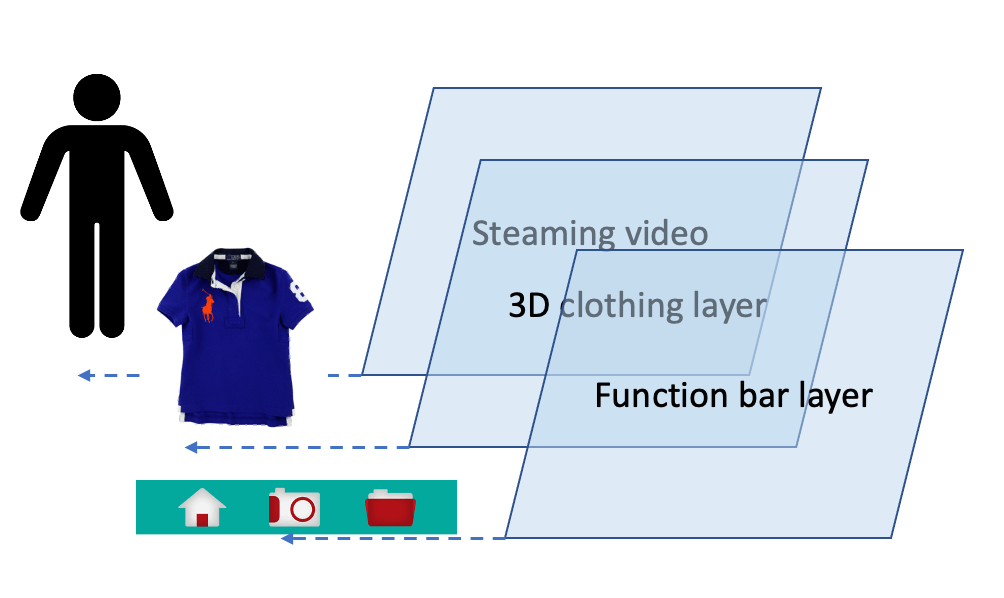
Image 06: 2D UI mockup diagram
We did the digital prototype for testing the upper function bar and middle browsing bar position. There is a three-layer design of the user interface in the AR system. (See the diagram on 06 )The function bar is a 2D banner bar that sticks on the top part of the screen. The second layer is the clothing 3D model. The background is the real-time streaming video from the image sensor upload.
The problem of 2D user interface
1. Mis-trigger from nature body gestures: from the user testing, we discovered two mis-trigger behaviors. The first is that the upper part function bars are too easily triggered when the users raise their hand the try the 3D virtual clothes on. The second mis-trigger signal is the browsing bar in the middle when the user puts the hand down and swings their hands around their waist area. Originally I wanted the user to easily reach the function bars. Therefore I set up the function bar position on the upper part and waist part. But I didn’t aware of the human nature behaviors of hands up and down when they try clothes on. Those are mis-triggers actions in the visual sensor system when the user interfaces stick on the top layer of the screen. (See image 05)
2. Without the gender selection: another problem I notice about how to choose the male and female clothes. I didn’t classify the clothes by gender in the first information architecture diagram. Accordingly, we added gender to the selection conditions of the second version IA diagram.
3. Misunderstanding of the “Home” icon: the testing subjects thought the “Home” button is back to its initial status. But the system provides the release of the current status. The testing subjects have to press twice when they were on the clothing selection model. The system needs to release the bottom parts first then the tops second which becomes too operation levels.
User Interface Design V2.0
Summing up the problems in the upper paragraph, I modified the IA diagram. (See image 07) I added the gender selections under the clothing tops and bottoms elements. I change the share functions to auto-uploads to online databases.
Modified Information Architecture Diagram version 2.0

Image 07: keep three level on the hierarchy
Modified User Flowchart version 2.0

Image 08:6 steps and 2 actions of the user flower
At the same time, we modified the user flow based on the IA version 2.0. The user flow became more complex when added the gender layer into the new IA 2.0. But I kept the operations process in two hierarchies which reduce the operation steps. (See image 08)
As a consequence, this new user flow puts three elements on the same selection layer which are clothing tops, bottoms, camera, and home/reload. And the gender selection would be in the same layer too. The users were free to go back to the auto start model and take photos anytime.
When the user confirms the virtual outfit in AR mode. The user could take a photo via the camera button. The system would auto-generate the QR code and auto-upload the photo to the online database. I extend the time frame from 5 seconds to 30 seconds when the QR code shows up. Due to the user needing the time to open their QR code scan APP.
The system will auto back to auto-start mode after the system completes uploading a photo.
The user interface changed from 2D to a 3D design concept. The Z-axis definition is very important for the 3D user interface which expresses the object’s depth. The UI position changes from absolute to relative mode. The center of the relative position is the user’s standing (X, Y, Z) position in the real world. Of course, the image input device changed to the depth visual sensor. (See image 09) On the other hand, the visual sensor provided parameters of body height and with which UI widgets could dynamically change proportional scaling with different users.
The user could choose the tops/bottoms button then the 3D virtual clothes will show the preview icon. I use color code to classify the gender difference when popping up the clothing selection menu bar around the waist. The male is blue on the left-hand side. The female is pink on the right-hand side.
Some users feel the “home” icon is too easy to misunderstand. So I change the graphic “home” to “reload” which expresses the meaning of circle back.
3D UI mockup diagram

Image 09: the user center is the start point(0,0,0) in the 3D AR system
3D User Interface Testing
I invited five users to join 3D user interface testing who already tried the first version user interface. Four users have AR game experiences via mobile phone. One had 3D AR interface experiences via Kinect device. This AR virtual fitting room used the Kinect 2.0 device. Therefore the user’s stand distance is around 1.5~2 meters which is the best sensing area. (See the photo on right)

Image 10: the operation distance with the display

Image 11: the virtual buttons on the 3D user interface
There are three user feedbacks after the 3D user interface testing:
1. Using a push gesture that mimics the natural human gesture: the users bend their front arm to touch the virtual buttons on the left-hand side and waist side. This way could avoid the mis triggers and behavior like real touch gestures in the real environment.
2. The proportional scaling provides the micro-customization 3D user interface. The body height of testing subjects was from 155 cm to 185 cm in the user testing. In the first version of UI, the different body heights shown on the screen caused the shorter testing subject couldn’t touch the buttons on the upper function bar and the higher testing subjects’ heads would exceed/overlap with the upper function bar. The new system would auto-change the UI size based on the different body scales on the screen. So the testing subjects feel it is an easier operation than the first version of UI.
3. Easy back to the initial status via reload function. I level up the textiles selection, camera, and reload function in the same hierarchy on the second version user flowchart. During the first user testing, we know the testing subjects are easy to change their mind when they try on clothes or take photos. They would like to go back to the initial status and keep trying other outfits or setting new postures anytime. Therefore the second version of user flow could represent the real fitting room phenomenon in the real physical environment.
Conclusion
The Twice validation of the AR virtual fitting room provides the different concepts of 2D and 3D user interface design. There are two points I learn from our testing subjects of the 3D AR user interface.
1. Using the z dimension on 3D user interface design. actually, people used to stretch themselves in a 720-degree freedom physical environment. The AR system combines the physical scene and virtual interactive objects of the real human experiences. So the designer should use the z dimension to think about the UI layers and set up the human gestures to reflect a 720-degree freedom possibility.
2. The flexible body scale on the display system. The human scale range is based on the body height and length in the real physical environment. People could freely touch anything around them in the real physical environment. But the body operation range on the AR system is still based on the fixed 2D screen size which depends on the resolution of the display hardware. Therefore the 3D user interface could flexibly change based on the users’ body scale which could avoid mis-triggers and user gestures over display range.
The primary stakeholder of Everlight Chemical’s point of view is that the system not only displays the color chemical application products but also excites more future application ideas for the company visitors.